What Negative Space Actually Is
Negative space is the area in a composition that isn’t occupied by objects or key subjects. It’s the space around and between things what’s not there, visually speaking. But calling it “blank” doesn’t cut it. In good design, negative space is just as active and intentional as the rest. It gives breathing room, structure, and clarity. It’s not empty. It’s doing work.
Positive space, on the other hand, is what we usually focus on the tree, the face, the product. That’s where the eye goes first. But without negative space shaping the boundaries and directing attention, positive space loses impact fast. Think of it like music: the rests are just as important as the notes.
Used well, negative space can highlight meaning, add rhythm, and create balance. It’s not a background detail or accidental leftover it’s a deliberate part of the visual story. Think of it as the silence that speaks.
Why It Works: The Psychology Behind the Silence
Our brains are built to find meaning in space. We naturally seek out patterns, figures, and focal points especially when they’re surrounded by quiet. In visual storytelling, negative space isn’t just the absence of stuff; it helps direct attention. It tells the eye where to land and gives the viewer a chance to breathe.
When things are cluttered, the brain has to work overtime. But when empty areas are used intentionally, they create impact. You can lead a viewer straight to the subject no arrows, no distractions. That clarity is subtle, but powerful. It’s felt more than noticed.
There’s also emotion in emptiness. A sparse background might suggest loneliness, isolation, calm, or even suspense. It gives a viewer room to interpret, to project their own feeling into the piece. And that’s where a lot of the magic happens: in what’s not said, not drawn, not filled.
Good negative space isn’t blank. It’s purposeful. It shapes the story without shouting.
Techniques to Master Negative Space

Negative space isn’t just what’s left blank it’s a strategic design element that can elevate your artwork when used intentionally. Here are several key techniques to help you make the most of your composition through the power of absence.
Frame Your Subject with Intentional Voids
One of the most compelling ways to use negative space is to frame the main subject by surrounding it with emptiness. This method draws attention inward and heightens the impact of what remains:
Leave consistent space around key elements for visual clarity
Use buffers around your focal point to create isolation and importance
Experiment with asymmetrical framing to create dynamic tension
Balance and Asymmetry: A Subtle Tug of War
Effective compositions often rely on an equilibrium of visual weight even when that balance tilts unconventionally.
Consider using:
Asymmetry to create interest without visual overload
Strategic off center placement to make your viewer pause
Uneven spacing to guide the eye in a specific direction without feeling chaotic
Leverage Contrast in Color, Texture, and Tone
Negative space isn’t limited to plain white backgrounds. Varying the contrast within your empty areas enhances depth and dimension.
Ways to create contrast:
Place bold colors against neutral or desaturated backgrounds
Use texture in negative space to create visual rhythm
Work with tonal shifts to separate foreground from background without clutter
Minimalism with a Message
Minimalist design is the purest playground for negative space. But minimal doesn’t have to mean empty it should still speak clearly.
To maintain impact with fewer elements:
Focus on a single, powerful subject or shape
Eliminate unnecessary visual noise
Let whitespace elevate the importance of what remains
Mastering these techniques can help you create compositions that don’t just impress but resonate emotionally through what’s not immediately seen.
Real World Applications
Negative space isn’t just an abstract design principle it’s on the front lines of practical creative work. In graphic design, especially logo creation, it’s what separates forgettable from iconic. Think FedEx or NBC smart spacing speaks volumes, often embedding secondary images or ideas into the void. It helps brand identities feel intentional and clean, not cluttered.
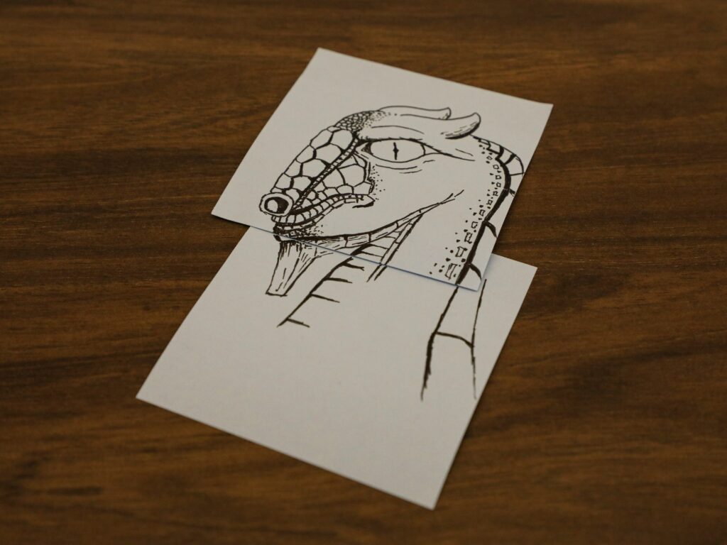
Illustrators use negative space to unpack complexity. When the subject gets dense medical concepts, data visualization, or technical schematics empty space becomes clarity. It slows the eye down. It signals what matters. It makes the viewer a quicker reader of the message.
In photography, negative space helps isolate a subject. A single chair, a person walking across an empty parking lot the space around them becomes as important as the subject itself. It gives images mood, depth, and distance. It controls what the viewer sees first.
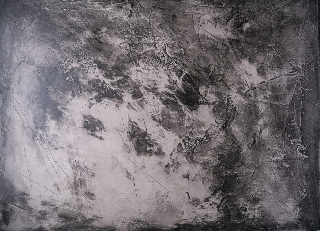
Fine artists, too, lean into it. They’re not just layering paint they’re layering meaning by leaving things unsaid. In some pieces, what’s missing is louder than what’s present. That tension makes people stop and stare a little longer.
Want to dive deeper? Take a look at the use of negative space in various media to see how restraint becomes a powerful design move.
Common Pitfalls to Avoid
Even experienced artists can struggle to use negative space effectively. While the concept seems simple, poor execution can leave your work looking flat, confusing, or even unintentional. Here’s where things often go wrong:
Mistaking Emptiness for Impact
A common mistake is assuming empty space automatically adds sophistication. However, negative space should serve a clear compositional purpose. If the surrounding space doesn’t support the subject, it can feel neglected rather than intentional.
Ask: Does this space frame or emphasize the subject?
Avoid leaving areas blank with no role in the visual hierarchy
Watch for compositions that feel unfinished or insubstantial
Getting Stuck in Overanalysis
Second guessing every inch of negative space can paralyze creativity. Creators often stall mid process, adjusting voids endlessly in pursuit of perfection. But negative space isn’t meant to be over polished it’s most effective when it feels natural.
Don’t aim for pixel perfect balance in every piece
Trust your artistic intuition alongside design principles
Give your layout time to breathe before over editing
Misjudging Visual Balance
Negative space influences visual weight. Misreading that weight can throw off an entire composition even when the elements themselves are strong. It’s important to develop a feel for how balance works across the full canvas.
Use thumbnails or mirrored sketches to test balance visually
Watch for areas that feel too heavy or too vacant
Be cautious with asymmetry intent is key
Mastering negative space means knowing not just how to use it, but when and where. Thoughtful application enhances clarity and emotional resonance. But when poorly handled, it can undermine the very impact you’re trying to create.
Turning Absence into Power
Sometimes, impact isn’t about what you add it’s about what you leave out. In a scroll happy world saturated with visual noise, negative space becomes a quiet force. Knowing when to stop, or even erase, is a skill. When a composition feels too crowded or the focal point gets lost, it’s a signal: subtract, don’t stack.
This isn’t just about minimalism. It’s about control. Clean space draws the eye to your subject and gives the viewer somewhere to rest. That pause? That breath? It’s intentional. Let the white space do its job. Let it shape the message. The most confident pieces often say more by showing less.
Be deliberate. Cut clutter. Make room on the canvas or the screen like you’re creating a path through silence. And when it feels risky to leave something out, that might be the exact moment you should.
For actionable techniques and examples, check out this guide on the use of negative space.


